index.html
<!DOCTYPE html>
<html lang="en">
<head>
<meta name="viewport" content="width=device-width, initial-scale=1.0" />
<title>Responsive Navigation Bar</title>
<!-- Font Awesome Icons -->
<link
rel="stylesheet"
href="https://cdnjs.cloudflare.com/ajax/libs/font-awesome/6.0.0-beta3/css/all.min.css"
/>
<!-- Google Fonts -->
<link
href="https://fonts.googleapis.com/css2?family=Poppins:wght@600;700&display=swap"
rel="stylesheet"
/>
<!-- Stylesheet -->
<link rel="stylesheet" href="style.css" />
</head>
<body>
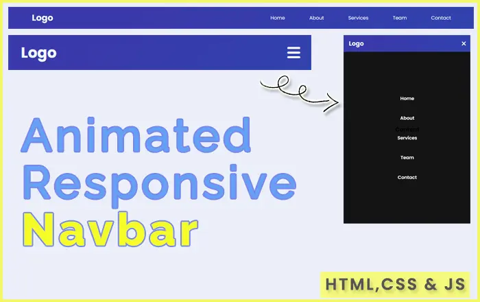
<header>
<nav>
<a href="#home" id="logo" style="color: aliceblue;">Logo</a>
<i class="fas fa-bars" id="ham-menu" style="cursor: pointer;"></i>
<ul id="nav-bar">
<li>
<a href="#home">Home</a>
</li>
<li>
<a href="#about">About</a>
</li>
<li>
<a href="#services">Services</a>
</li>
<li>
<a href="#team">Team</a>
</li>
<li>
<a href="#contact">Contact</a>
</li>
</ul>
</nav>
</header>
<section id="home">
<h1>Content</h1>
</section>
<!-- Script -->
<script src="script.js"></script>
</body>
</html>
style.css
@import url('https://fonts.googleapis.com/css2?family=Poppins:wght@200;300;400&display=swap');* {padding: 0;margin: 0;box-sizing: border-box;}html {font-family: 'Poppins', sans-serif;}header {position: fixed;width: 100%;background-color: #3142ae;background-image: linear-gradient(315deg, #3142ae 0, #3a39aa 74%);padding: 1rem 5rem;}nav {display: flex;justify-content: space-between;align-items: center;}nav ul {list-style: none;display: flex;gap: 5rem;}nav a {font-size: 1.8rem;text-decoration: none;}nav a#logo {color: #000000;font-weight: 700;}nav ul a {color: #ffffff;font-weight: 500;font-size: 16px;}nav ul a:hover {opacity: .8;}section#home {height: 100vh;display: grid;place-items: center;}h1 {font-size: 3rem;}#ham-menu {display: none;}nav ul.active {left: 0;}@media only screen and (max-width: 991px) {html {font-size: 56.25%;}header {padding: 2.2rem 5rem;}}@media only screen and (max-width: 767px) {html {font-size: 50%;}#ham-menu {display: block;color: #ffffff;}nav a#logo, #ham-menu {font-size: 3.2rem;}nav ul {background-color: #000000eb;position: fixed;left: -100vw;top: 73.6px;width: 100vw;height: calc(100vh - 73.6px);display: flex;flex-direction: column;align-items: center;justify-content: center;transition: 1s;gap: 50px;}nav ul a {color: #ffffff;font-weight: 600;font-size: 18px;}}@media only screen and (max-width: 575px) {html {font-size: 46.87%;}header {padding: 2rem 3rem;}nav ul {top: 65.18px;height: calc(100vh - 65.18px);}}script.js
let hamMenuIcon = document.getElementById("ham-menu");
let navBar = document.getElementById("nav-bar");
let navLinks = navBar.querySelectorAll("li");

hamMenuIcon.addEventListener("click", () => {
  navBar.classList.toggle("active");
  hamMenuIcon.classList.toggle("fa-times");
});
navLinks.forEach((navLinks) => {
  navLinks.addEventListener("click", () => {
    navBar.classList.remove("active");
    hamMenuIcon.classList.toggle("fa-times");
  });
});
1.95 KB