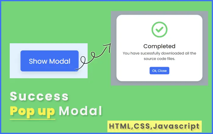
Success Popup Modal using HTML, CSS, JAVASCRIPT
Sep 17, 2021
Live Preview
index.html
<!DOCTYPE html>
<html lang="en">

  <head>
    <meta charset="UTF-8" />
    <meta http-equiv="X-UA-Compatible" content="IE=edge" />
    <meta name="viewport" content="width=device-width, initial-scale=1.0" />
    <title>Popup Modal Box | Atech Seva</title>
    <!-- CSS -->
    <link rel="stylesheet" href="style.css" />
    <!-- Fontawesome CDN Link -->
    <link rel="stylesheet" href="https://cdnjs.cloudflare.com/ajax/libs/font-awesome/6.2.0/css/all.min.css" />
  </head>

  <body>
    <section>
      <button class="show-modal">Show Modal</button>
      <span class="overlay"></span>
      <div class="modal-box">
        <i class="fa-regular fa-circle-check"></i>
        <h2>Completed</h2>
        <h3>You have sucessfully downloaded all the source code files.</h3>

        <div class="buttons">
          <button class="close-btn">Ok, Close</button>
        </div>
      </div>
    </section>

    <script>
      const section = document.querySelector("section"),
        overlay = document.querySelector(".overlay"),
        showBtn = document.querySelector(".show-modal"),
        closeBtn = document.querySelector(".close-btn");
      showBtn.addEventListener("click", () => section.classList.add("active"));
      overlay.addEventListener("click", () =>
        section.classList.remove("active")
      );
      closeBtn.addEventListener("click", () =>
        section.classList.remove("active")
      );
    </script>
  </body>

</html>
style.css
/* Google Fonts - Poppins */
@import url("https://fonts.googleapis.com/css2?family=Poppins:wght@300;400;500;600&display=swap");

* {
  margin: 0;
  padding: 0;
  box-sizing: border-box;
  font-family: "Poppins", sans-serif;
}
section {
  position: fixed;
  height: 100%;
  width: 100%;
  background: #e3f2fd;
}
button {
  font-size: 18px;
  font-weight: 400;
  color: #fff;
  padding: 14px 22px;
  border: none;
  background: #4070f4;
  border-radius: 6px;
  cursor: pointer;
}
button:hover {
  background-color: #265df2;
}
button.show-modal,
.modal-box {
  position: fixed;
  left: 50%;
  top: 50%;
  transform: translate(-50%, -50%);
  box-shadow: 0 5px 10px rgba(0, 0, 0, 0.1);
}
section.active .show-modal {
  display: none;
}
.overlay {
  position: fixed;
  height: 100%;
  width: 100%;
  background: rgba(0, 0, 0, 0.3);
  opacity: 0;
  pointer-events: none;
}
section.active .overlay {
  opacity: 1;
  pointer-events: auto;
}
.modal-box {
  display: flex;
  flex-direction: column;
  align-items: center;
  max-width: 380px;
  width: 100%;
  padding: 30px 20px;
  border-radius: 24px;
  background-color: #fff;
  opacity: 0;
  pointer-events: none;
  transition: all 0.3s ease;
  transform: translate(-50%, -50%) scale(1.2);
}
section.active .modal-box {
  opacity: 1;
  pointer-events: auto;
  transform: translate(-50%, -50%) scale(1);
}
.modal-box i {
  font-size: 70px;
  color: #75d479;
}
.modal-box h2 {
  margin-top: 20px;
  font-size: 25px;
  font-weight: 500;
  color: #333;
}
.modal-box h3 {
  font-size: 16px;
  font-weight: 400;
  color: #333;
  text-align: center;
}
.modal-box .buttons {
  margin-top: 25px;
}
.modal-box button {
  font-size: 14px;
  padding: 6px 12px;
  margin: 0 10px;
}